Investigate an attack wave
One investigation, start to finish: spot a pattern, isolate it in one click, find the attackers behind it, ban them. The same moves work on any dimension.
The scenario
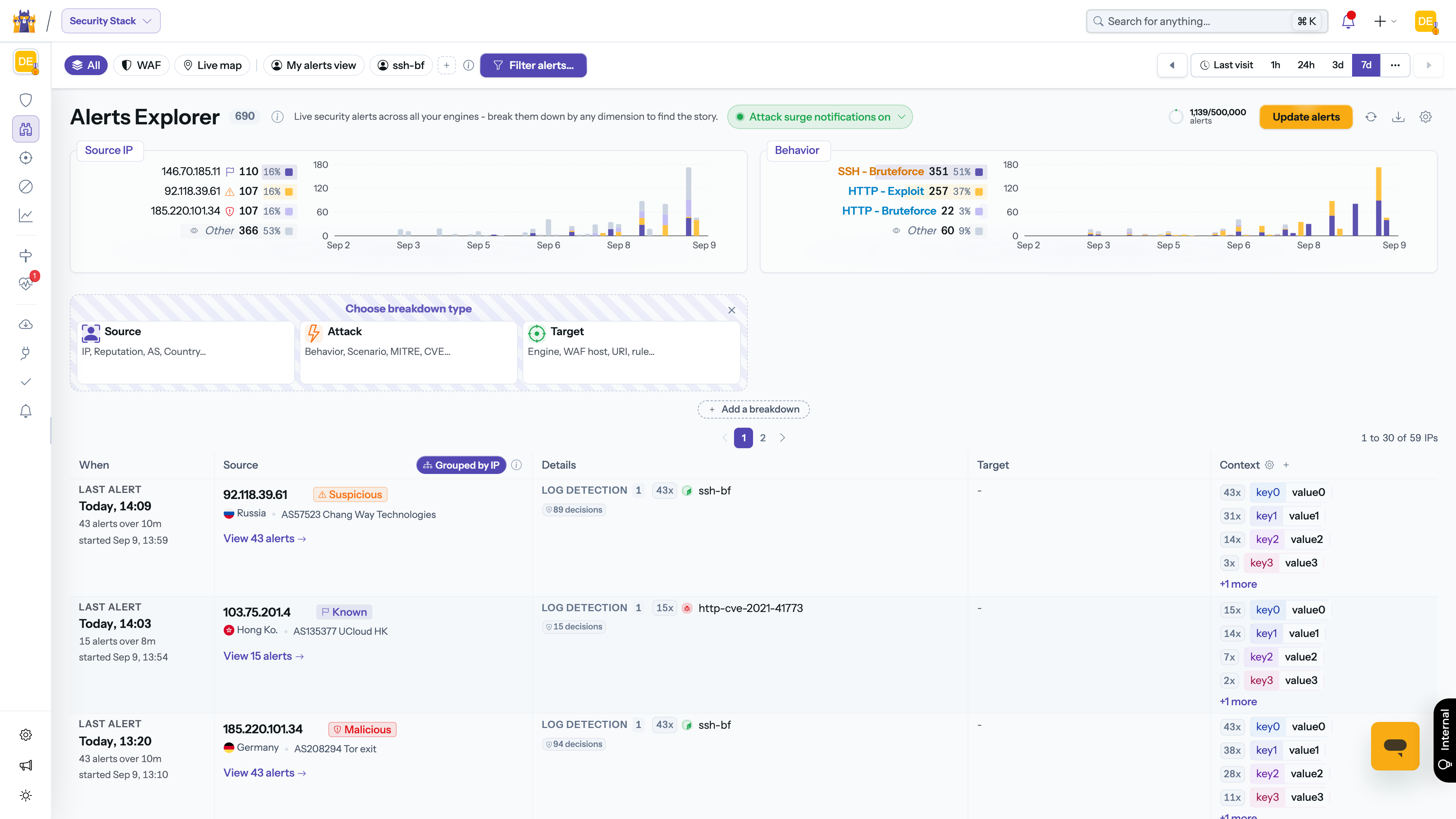
You open the Alert Explorer after a quiet week and glance at the Behavior breakdown. Most of the activity is the usual background noise, but one behavior shows a clear ramp-up over the last three days: ssh-bruteforce, barely present before, now dominates the chart.
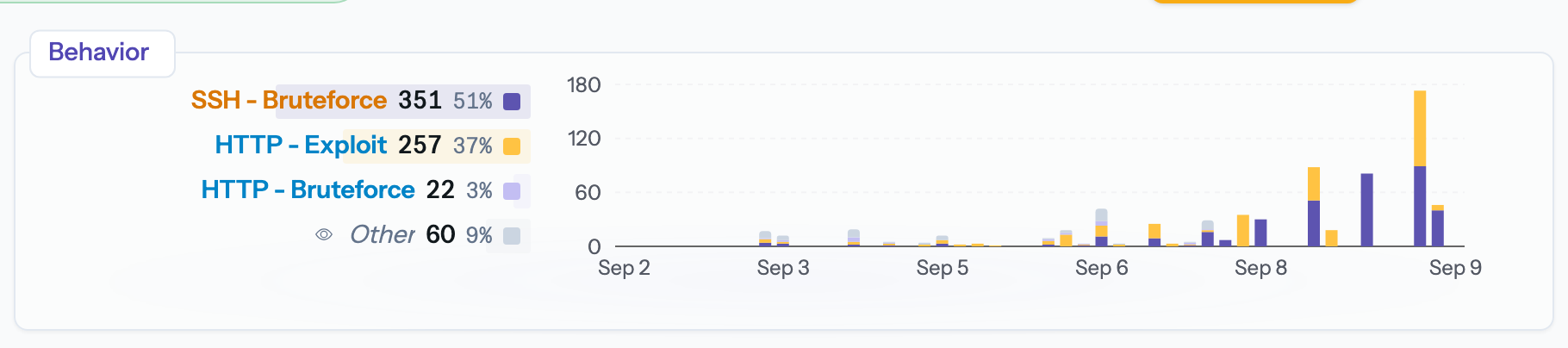
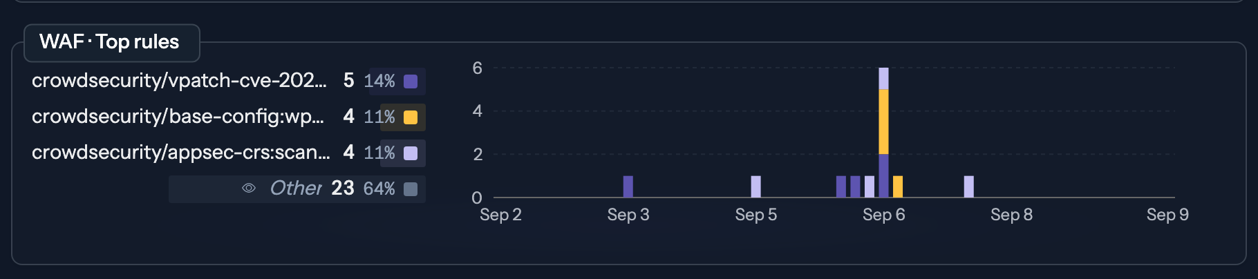
Step 1 - Isolate the wave
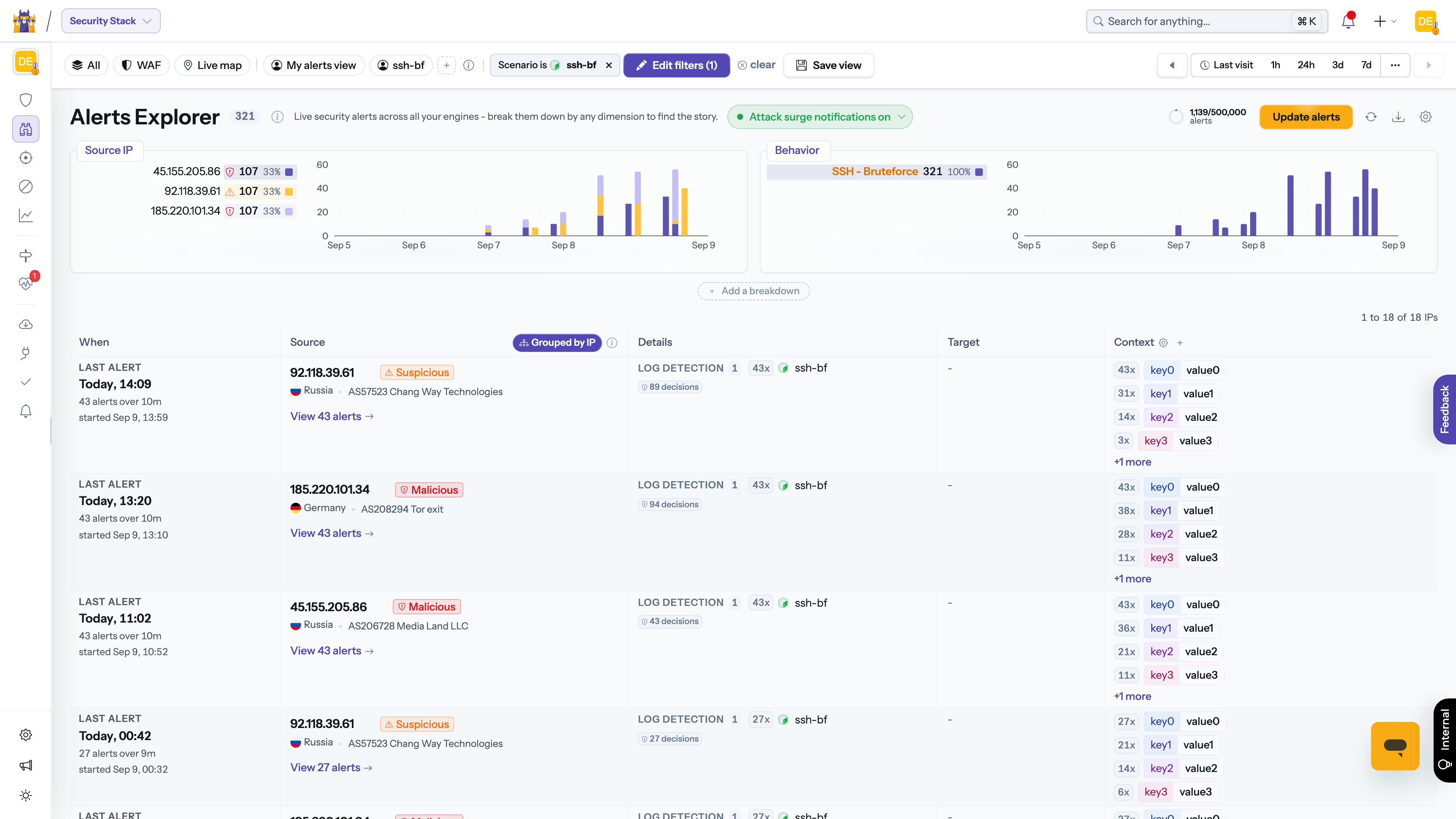
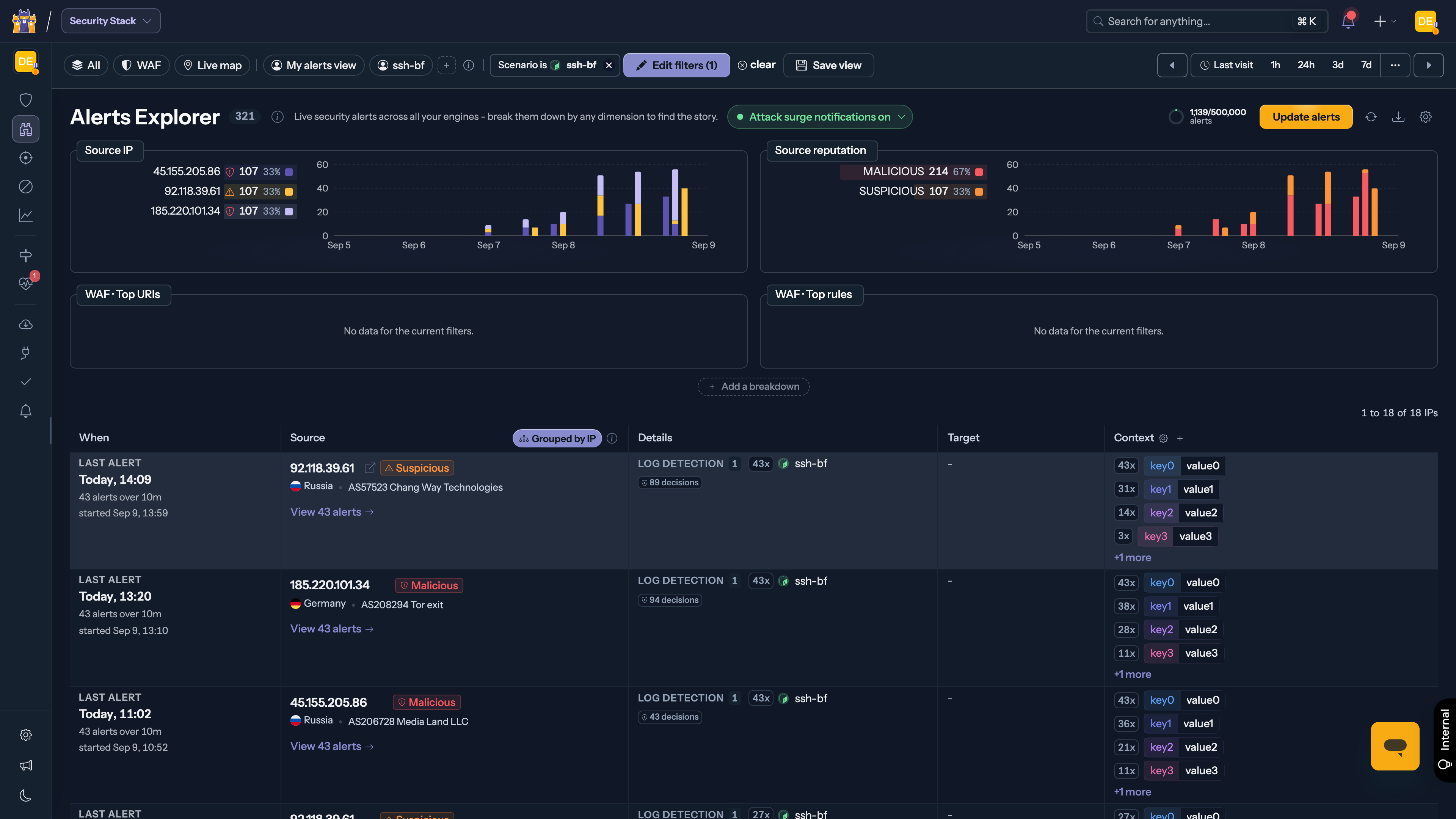
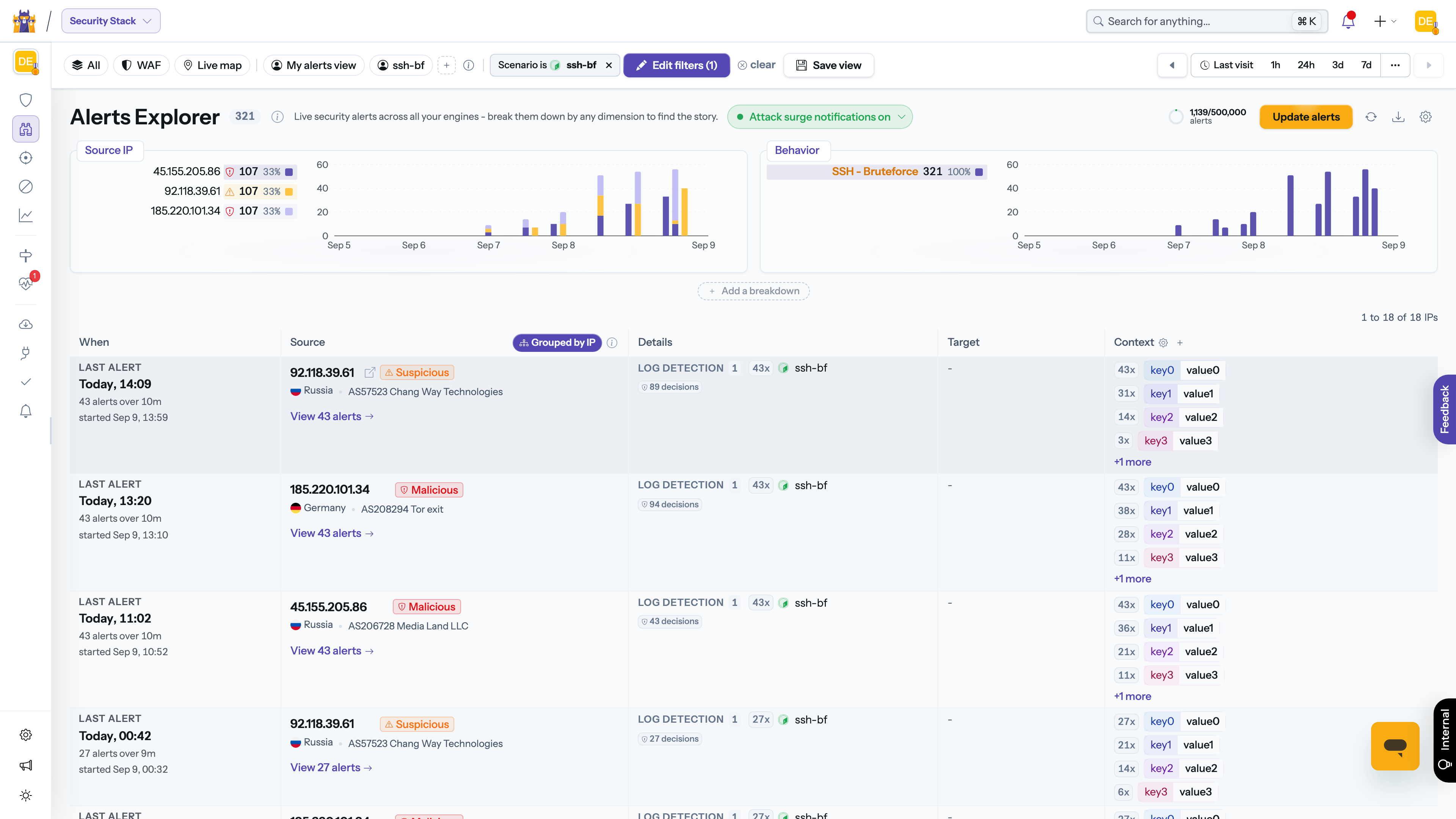
Click the suspicious area of the chart. The Explorer applies the matching filter: every chart and the table below now only show ssh-bruteforce activity. The filter appears as a chip above the table, ready to be removed when you are done.
You can also zoom in time: drag a range on any chart to narrow the period to the wave itself.
Step 2 - Find who is behind it
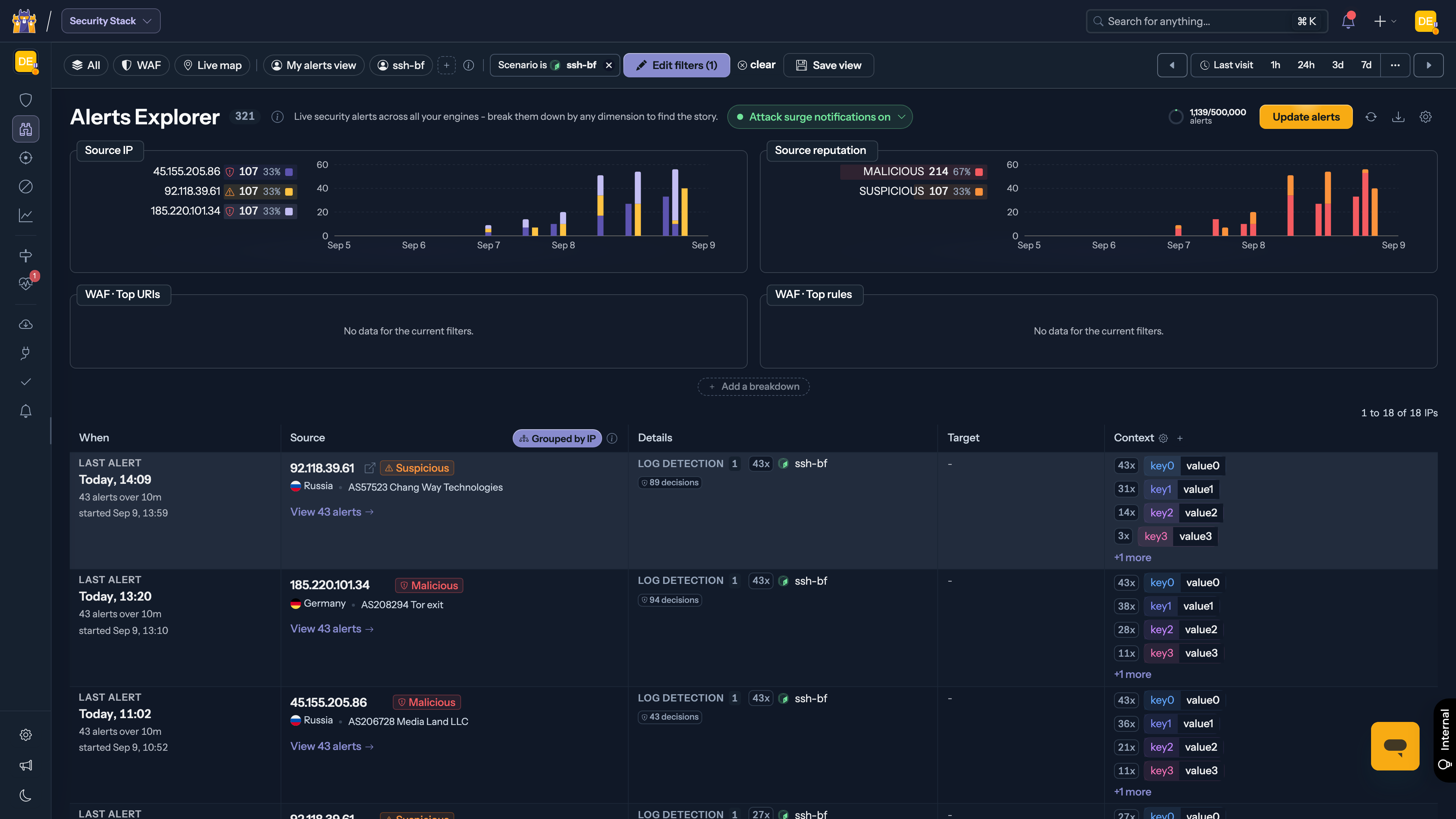
The table groups alerts by attacking IP: what looked like hundreds of alerts collapses into a handful of attackers, each with its session count, targets and time range. Expand a row to see the individual attack sessions - when each burst started, which engines were hit, how many decisions were taken.
Step 3 - Understand and act
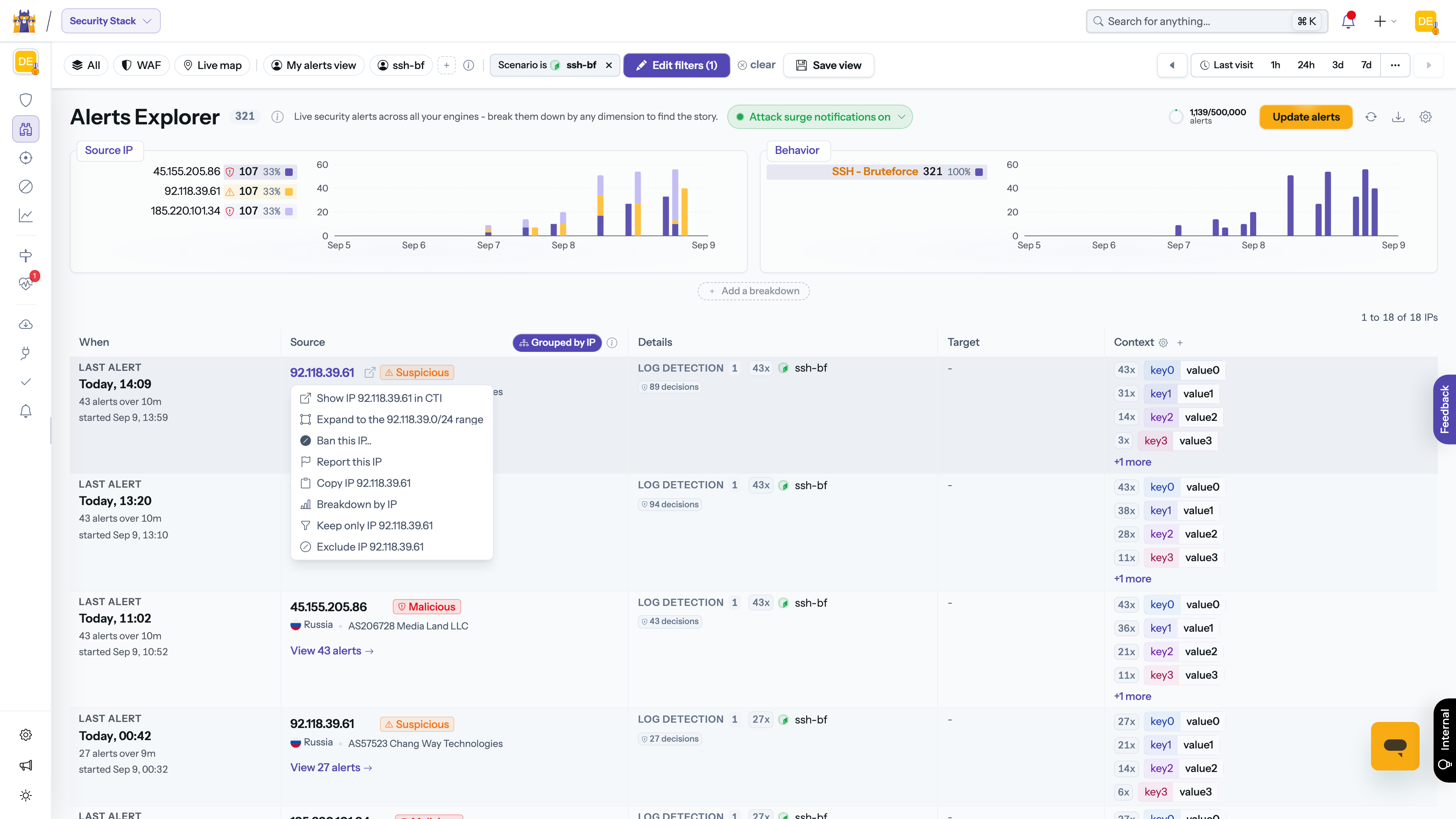
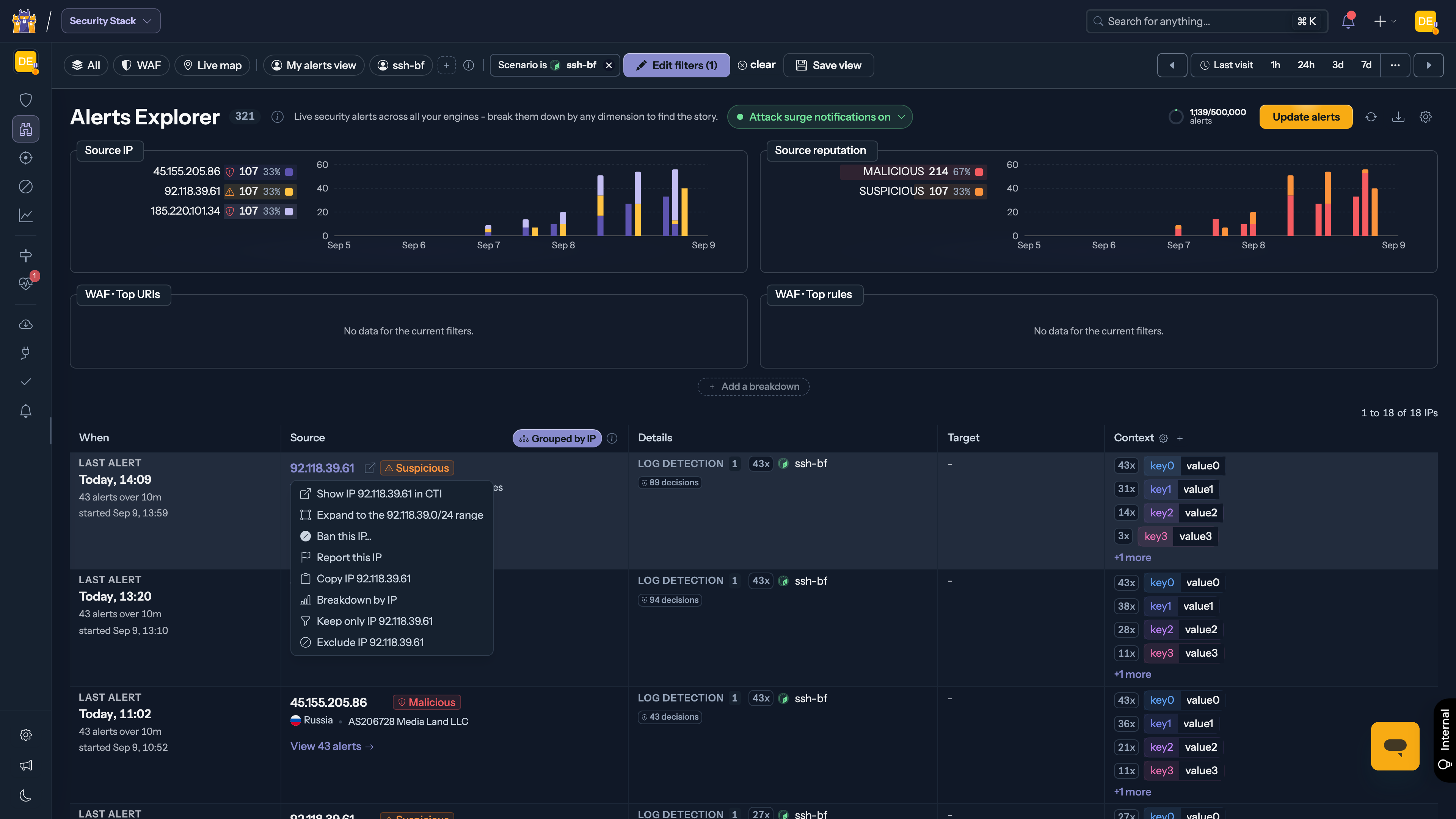
From an attacker's row:
- Pivot to CTI - open the IP's full CrowdSec threat intelligence profile: reputation, history across the network, associated behaviors.
- Ban the IP - push a decision to all your Security Engines, or a subset, directly from the context menu.
- Report a false positive - if the traffic turns out to be legitimate, report it to improve the network's consensus.
Adapt it to your own charts
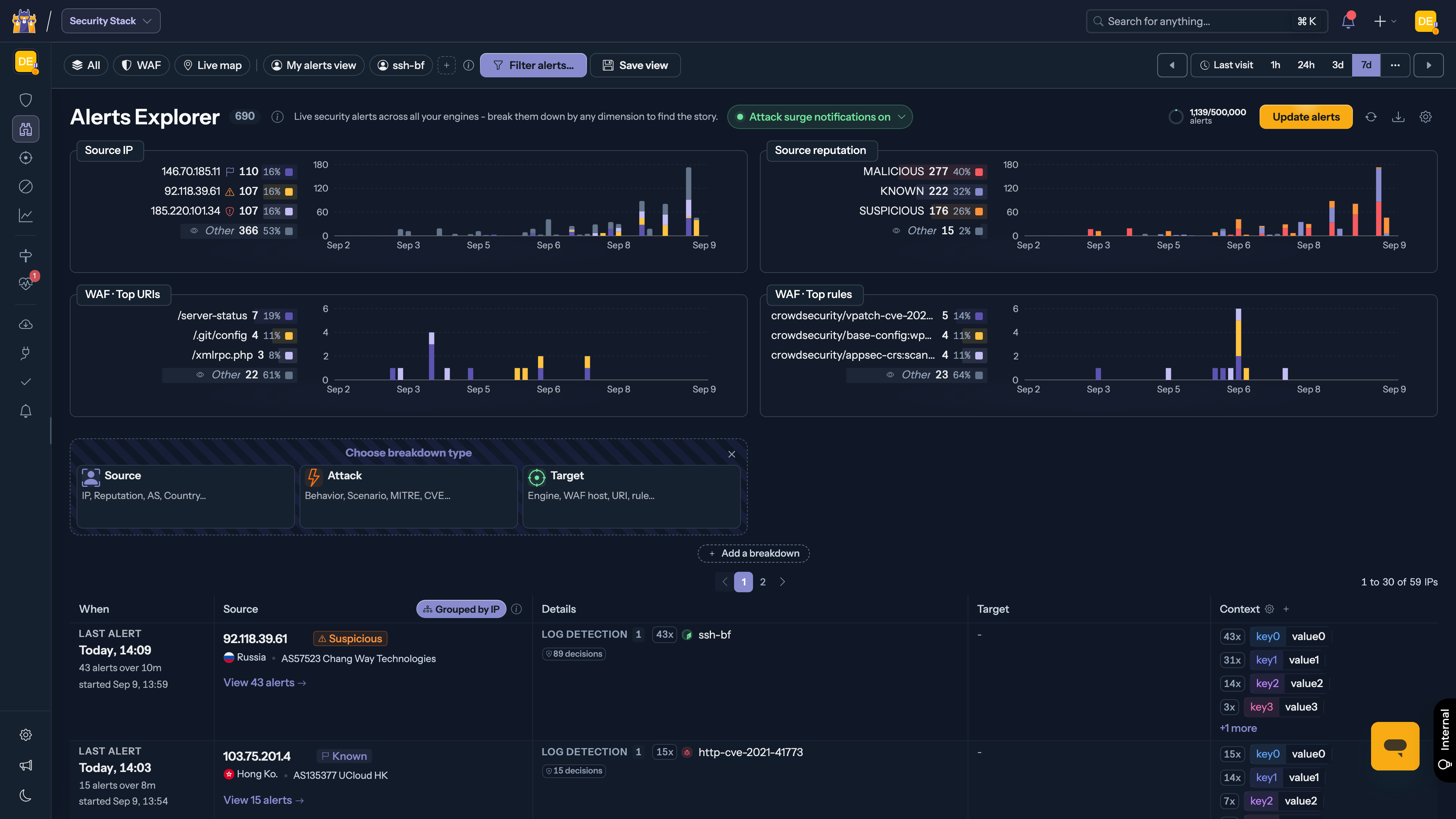
The walkthrough used the Behavior breakdown, but every step works on any dimension. Use Add a breakdown to bring in the charts your investigation needs: source countries, autonomous systems, IP reputation, scenarios, target engines... Each card can be zoomed, expanded, or removed, and the layout is yours - it stays as you left it.
Key considerations
- Grouping by IP merges alerts into 30-minute attack sessions; switch grouping off in the table header to work on raw alerts.
- Greyed "Out of quota" bands in the charts mark periods your organization exceeded its alert quota: alerts in those periods were not retained.
- Charts show the period selected in the top bar; the arrows navigate window by window, and "Last visit" jumps to everything since you last looked.